Black to the Bones
Creative idea
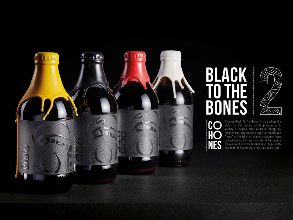
Meet Cohones Black To The Bones 2. Sealed with four associatively selected colours of wax to distinguish the alcoholic infusions in the four recipes: whiskey, bourbon, rum and Bulgarian slivovitz rakia. Keeping its all black and white label, part of Cohones craft beer identity, and upgrading it with a brand new Cohones rooster mascot illustration in the style of the famous Mexican Holiday, The Day of The Dead (Dia De Muertes). Stripped to its very black bones, hidden in the label with an overprinted varnish so that it is even blacker than the black colour of the label itself.
Brand name: Cohones
Advertiser / client: Cohones Brewery
Product / service: Stout beer
Campaign name: Cohones Black to the Bones
Agency network: INDEPENDENT AGENCY
Agency: All Channels Communication
Executive creative director: Marin Kostov
Creative director: Aleksandrina Stefanova
Account director (agency): Sevdalina Andreeva
Strategic planner / strategist: Alexander Dourchev
Director of photography: Nikolay Abadjiev