Farm&Roll – an alternative flour identity
Creative idea
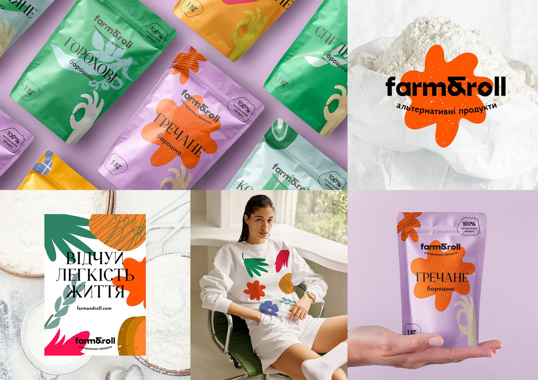
The Farm & Roll logo is designed with geometric grotesque letterforms in which the letter 'O' depicts a stylized millstone for grinding flour. In creating the design concept, we adhered to craft and environmental aesthetics. The graphic elements of the packaging are abstract illustrations of cereals from which the brand produces different flours. In combination, they form a pattern that is the basis of a design system that is easily used to create aprons, rocking chairs, and other merch items. A unique packaging feature is a transparent window with a 'Bon appetite' gesture, through which you can see the quality and the milling of the product.
Brand name: Farm&Roll
Advertiser / client: Farm&Roll
Product / service: Brand identity
Campaign name: Farm&Roll – an alternative flour identity
Agency network: INDEPENDENT AGENCY
Agency: Yarche, Kyiv
Creative director: Stas Raksha
Art director: Yaroslav Kryzhanivsky
Copywriter: Mariia Karmanna
Designer: Vlada Orel
Managing director: Danil Martynov
Pr director: Olena Zamora
Digital strategist: Veronika Kukharchuk