ZEMONO +
Creative idea
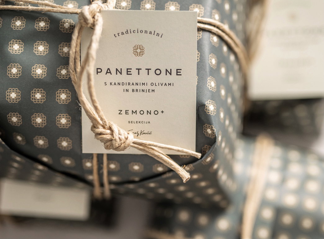
Zemono+ selection Tomaž Kavčič is the brand of one of the most recognisable chefs in Slovenia (Michelin star awarded), »Tradicionalni panettone« it's the first product of Zemono+ line. The idea mostly consisted of creating a traditional and luxurious packaging. We used a basic traditional Italian wrapping design consisting of paper and rope, but we were also aware, that the prestigious look of the packaging would define the perception of new brand. Icon meanings: - External/internal ground plan of Zemono mansion and arched exterior, - table with chairs, - hearts - 4 generations of Kavčič family, - Strong and meaningful connection with Malevich's Square and Cross.
Brand name: ZEMONO +
Advertiser / client: ZEMONO PLUS, d.o.o.
Product / service: ZEMONO + Tradicionalni panettone
Campaign name: ZEMONO + Tradicionalni panettone
Agency network: INDEPENDENT AGENCY
Agency: KLUN stories + spaces
Web address: http://www.klun-komunikacije.si/kako-konkretno/zemono
Executive creative director: Boštjan Klun
Art director: Ana Klun
Copywriter: Boštjan Klun
Designer: Manja Hibšer
Photographer: Boštjan Selinšek