Know the Tap
Creative idea
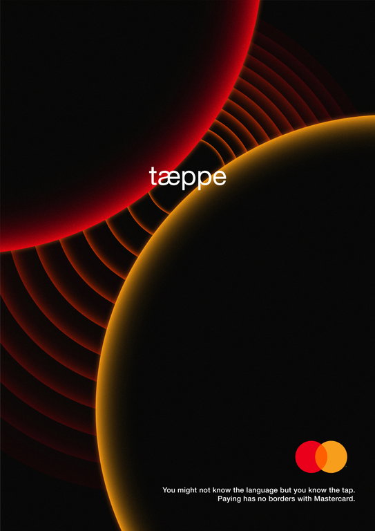
Core Insight We may speak different languages, but some gestures need no translation. A tap is one of them – a universal action that signals connection. The Mastercard logo embodies this idea: two seemingly separate circles coming together to form one recognisable symbol. But before that connection is established we have the point of first contact – the tap. Creative Concept We bring the Mastercard circles to life by focusing on the split second when they touch for the first time and tap. Through close-ups, we see the two circles approaching one another, just before and at the moment of contact, as we see the ripples and waves it causes. The word “tap” appears in different languages – Slovenian, German, Norwegian, Arabic, Chinese and more – changing with every market while the visual moment remains exactly the same. With this, we show that while the language might change, the act of connecting and in turn the act of paying, remains the same no matter what, as long as there is MasterCard. Why Mastercard The tap is at the heart of how we pay today: a small gesture that connects people, technology and commerce in an instant. It also exists in Mastercard’s logo before it fully forms, as the starting point of connection. So at its core, the brand already showcases this feeling of connectivity without borders. Global Scalability The idea is designed to travel. The Mastercard circles and the moment of contact remain consistent, while the word “tap” adapts to the local language and culture. From one market to the next, the execution changes just enough to feel local, while the core idea remains universally recognisable: a connection built by just one tap.
Agency: Noble Graphics, Sofia
Authors: Bozhidar Ivanov & Zhivko Bozdanski